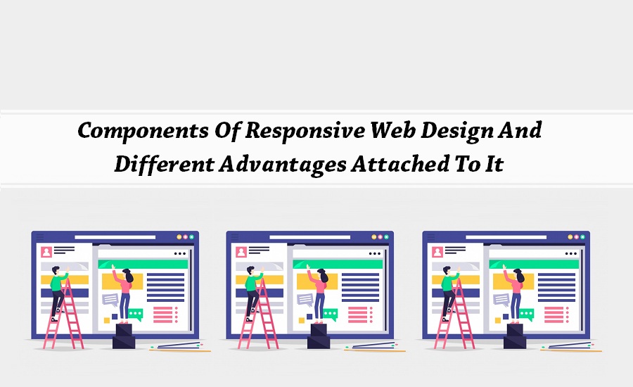
There has been a surge in the number of users browsing mail through different portable devices. When the mobiles that enable internet browser first surfaced the designers built websites that aimed for mobile devices. But, it has been observed that users did not have the same experience that they have in other devices. Gradually, the designers have adapted to responsive web design to make these website compatible to mobile devices. This form of designing helps the websites reshape the websites so that it can fit to the screens of different size and resolution. Be it a personal computer or your Smartphone, you will have a uniform experience in all the devices.
Adapts To Different Devices
Unlike the other methodologies, responsive web designing, utilizes CSS and different cascading sheets to change a websites’ layout to suit different devices. In fact, it also enables change in the display depending on the device that you have chosen. The main components of this type of web designing are the use if grid based images, media queries and responsive layouts. Responsive layouts help the display to adjust to different screen environment. It adapts to different requirements of users and conditions of viewing. Thus, it enhances the overall experience of viewing of a website.
Resize The Images
With responsive images, you can crop the image or resize it proportionately. This form of web designing enables resizing of the images automatically. For viewing, a website on the mobile or other portable devices, adjustment of the images is of utmost importance. Another way of developing a responsive web design is through the use of media queries. With this, designers can create different layouts with the help of HTML documents, and based on the resolution of the screen, and the browser size, they can choose proper style sheets. It also helps to resize the webpages and displays and hides different links and buttons to enhance the navigation of the site.
Optimizes Reading Experience
This type of web designing also helps in optimizing the reading experience in the mobile or other portable devices. It can be considered to be the next big thing in the world of designing. It can be considered to provide one stop solution for both the designers and clients. It helps to maintain a uniform look across different devices. A number of advantages are attached to this type of web designing, for this reason; this is alluring to web designers, clients and also marketing strategies.
No Effect On SEO
The major advantage of this type of designing is that you have only one website to maintain. Unlike the mobile friendly website, you need not maintain different websites. This makes it easy to manage and add layouts of the page for different devices and optimize it for different devices. If you are wondering about how this designing will affect the search engine optimization of the site, then be sure that it does not have any effect on it. The SEO efforts will not get diluted as the bookmarks links all will point to one single URL.
Approved By Browsers
For any site, the presence in the social networking sites is importance to make their web presence prominent. In case the viewer’s shares your site, they will have the same experience even on their mobile device. If you are wondering whether this form of web designing only aims at the device that you are using, then you are wronged. It is about providing a good experience to the users. With this form of designing, there will not be any provision of the horizontal scroll bar. Even the different browsers approve this form of web designing. This is because, the website has only one URL and same HTML codes irrespective of the device that you use.

Never miss a story..!!
Grab the Latest SEO & SMO News, Tips, Updates & Trends..!!
See Our Blogcenter